This article is part of the 50 Apps by Christmas series

Color Eye is a Windows Phone 8 app that creates colour schemes by sampling live data from the camera.

Working with Live Camera Data
As I’d not worked with the camera in a Windows Phone app before I needed to learn the basics. One of the best sources to get up to speed on a particular specific topic are the samples. I started with the Camera Grayscale Sample to learn how to “pump” the values from the camera and how to get an array of colour values.
More...
SHARE:
When designing an app or website it can be hard to come up with inspiration for colour ideas. One place to look is the local hardware/DIY store.
These stores usually have colour sample cards from the different paint manufacturers that are sometimes helpfully grouped into related/complimenting shades.
This image shows some cards from my local hardware store showing some purple and pink hues.

While it’s a low tech approach, it’s cool to see a whole load of colours “in the flesh” when these cards are laid out on the display stands.
If you’d like to learn more about colour choice and other design related topics such as Typography, check out my Pluralsight Introduction to Design course.
SHARE:
One way of thinking or planning colour is to think in terms of relative expansiveness, that is, the proportion of the use of different colours.
One way to describe this proportionality is to think in 3 groups:
- The Dominant Colour: proportionally the largest expanse of colour, e.g. the ground
- The Subdominant (or subordinate) Colour : the second largest expanse of colour after the dominant
- The Accent Colour: the colour with the smallest relative area
This doesn’t mean that we can only ever use just three colours, but it’s a nice conceptual model. We could, for example, have a single dominant colour and a single accent colour; but we might have 3 shades of a subdominant to create a greater range of visual possibilities.
A simple way to visualise this is to use a subdivided coloured square.
More...
SHARE:
My newest Pluralsight course has just been released.
It’s about learning the fundamentals of design and applying them to your own work.
It covers topics such as: typography, colour meaning and choice, fundamental Gestalt Principles, and some other important and useful principles.
From the description:
“Design is all around us but most of us don't notice it. By the end of this course you'll start to notice design elements in everyday life. By understanding the fundamentals of design, you can start to apply them to your software UI & UX, marketing materials, emails, web design and pretty much anything else you produce.”
You can check it out here.
SHARE:
This article shows one way of choosing and using a colour scheme in your Windows Store app.
The default style looks like this:
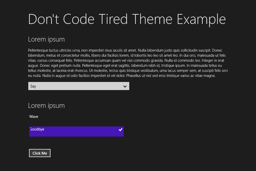
Step 1 – Choose a Colour Palette
We can use our fave colours or use a tool such as Adobe Kuler to help us come up with a scheme.
The screen shot below shows a Kuler theme “kathy 1” and it’s RGB values.
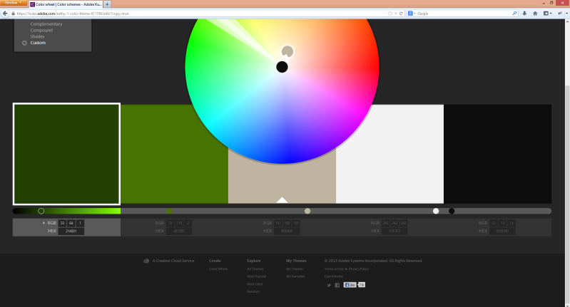
Our styled app will contain these colours.
More...
SHARE: