Redesigning DontCodeTired.Com Part 5 - Showing and Hiding Mobile Specific Elements
The idea of typography-out is that for websites where the textual content is king, it makes sense to elevate it to the thing of primary importance. The thing that drives the rest of the design. The opposite approach is to focus on the canvas as the first thing and work "inwards' to get to the content (text) last (putting "style" or "decoration" or "chrome" before content).
Letting Typography Lead the Design
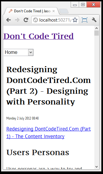
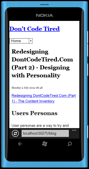
What I mean by this is the way the article text fills the screen on the mobile emulator: how many characters\words per line (i.e. the measure), leading, font size, typeface choice. All of these basic typogographic principles (of which I am not an expert) will be applied to make the content readable. Above all, readability is the primary consideration.
(Starting to learn more about typography (and other aspects of design) has given me insight and great respect for professional web designers...)
I'll consider reading distance (how far people are likely to be from the screen) as this informs the choice of font size, etc. For tablet\desktop usage, the font size may need to be different to accommodate different physical reading distances.
Choosing a Typeface
The CSS3 @font-face rule allows us to use typefaces that are different from the standard web-safe fonts. It allows us to reference new fonts to use on our sites by loading a font file into the browser and then referencing it in the CSS.
There are (as with anything Web related) different formats (WOFF, EOT, TTF/OTF, SVG) that different browsers support. The awesome Font Squirrel makes it easy to generate the CSS - and they have a load of "commercial-use free fonts".
I chose PTSansRegular for body and PTSerifCaptionRegular for headings, generating the @font-face and downloading multiple font format files courtesy of the awesome FontSquirrel. For the less important elements such as the published time I chose PTSansNarrowRegular.
Setting up the fonts
FontSquirrel generates a stylesheet.css which contains the @font-face definitions. This file sets the font-weight and font-style to normal for each of the included fonts.
This can cause a problem where text will be doubly emboldened or italicized. For example, if the <em> style below is used, the browser may try to initializes an already italic typeface and you may get horribly double slanted (italicized) text:
em {
font-family: 'PTSansItalic', Georgia, serif;
}
To fix this we can edit FontSquirrel's CSS and specify font-style: italic; in the font-face:
@font-face {
font-family: 'PTSansItalic';
src: url('PTS56F-webfont.eot');
src: url('PTS56F-webfont.eot?#iefix') format('embedded-opentype'),
url('PTS56F-webfont.woff') format('woff'),
url('PTS56F-webfont.ttf') format('truetype'),
url('PTS56F-webfont.svg#PTSansItalic') format('svg');
font-weight: normal;
font-style: italic;
}
(You can do this for bold typefaces too..)
A Nice Vertical Flow
We want the vertical flow of text to look good. One way we can do this is to space things vertically in a consistent way.
The rem unit of measurement is a newer CSS concept with some support. It is similar to em in that it is a relative measurement, but unlike em it is relative to the root HTML element rather than the element's immediate parent.
As rem is not supported in older browsers we can specify a px value first and then a rem value. This could be pretty tedious, but again SASS makes it less painful.
The following extract of SASS defines some variables and a mixin to set basic typography properties:
/*
Variables
*/
$baseFontSize: 16; // size for px values and rem calculations, i.e. 1 rem = this value
$lineHeightMultiple: 1.5; // e.g. 1.5 = 150% line height
$baseVerticalRhythm: $baseFontSize * $lineHeightMultiple;
@mixin standardTypeMeasure($multipleOfBaseRhythm){
$px :$baseVerticalRhythm * $multipleOfBaseRhythm;
font-size:  $px + px;
font-size: $px / $baseFontSize + rem;
line-height: ($px * $lineHeightMultiple) + px;
line-height: (($px / $baseFontSize) * $lineHeightMultiple) + rem;
}
This mixin can then be called from our CSS rules:
time {
@include standardTypeMeasure(0.5);
font-family: 'PTSansNarrowRegular', Georgia, serif;
}
This results in the following generated CSS:
time {
font-size: 12px;
font-size: 0.75rem;
line-height: 18px;
line-height: 1.125rem;
font-family: 'PTSansNarrowRegular', Georgia, serif; }
Browsers that do not understand rem will instead use the `px' value.
Investigating CSS Hyphenation
I experimented with CSS text justification and hyphenation but it didn't look great and current browser support at the time of writing is only 24.77%. I was testing in Firefox using the vendor prefix :
text-align: justify;
-moz-hyphens: auto;
A Nice Chrome Plugin
There is a nice Chrome browser plug-in which quickly lets you change the browser window to one of a number of preset sizes (e.g. iPhone, iPad etc.) or create your own.
For the mobile version I've been mostly using the Windows Phone 7 emulator, however this Chrome plugin will be great for future parts of the redesign.
In Conclusion
Throughout this section I've also been continuing to hide elements that are not good for mobile. I've also been fixing up bits of markup (for example on the add comments section) to make it easier to style.
At this point I'm still not thinking about non-typography elements such as decoration, colors, logos, etc. This part will come later (and is going to be heaps of fun).
This step took a lot longer than I thought it might, but I'm OK with that as one of the goals of this redesign is to focus on the text.
Screen Shots


SHARE: