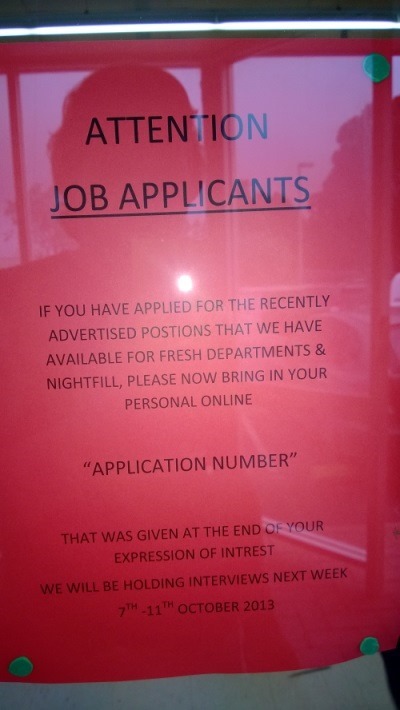
I recently saw this notice in a local grocery store window:

So it’s pretty ugly from a purely aesthetic point of view.
But more than that, I don’t feel that it effectively communicates the message.
Rather than just making it look prettier (which would be pretty easy given it’s current state) it’s good to first think about the problem it’s trying to solve.
People First
One way of approaching a design problem is to identify the people that are involved. By doing this we can identify the important end-goals that we’re trying to achieve with the design.
Store Owner
So first off we have the store owner(s).
The ultimate goal of the store is to fill the vacant job positions with the best possible people they can get.
One of the factors that contribute to this is to get as many possible applicants to apply. Judging from the content, this step has already happened and now the applicants have to follow-up with the action of actually coming into the store and bringing their online application number.
So we can summarise:
- Get online applicants to physically come to store and;
- to bring their online application number with them
Job Applicant
The job applicant simply wants to be awarded the position they applied for. To do this, they need to know that they have to bring in their online application number and not miss the opportunity of being interviewed.
Design Goals
From the above, we can define the overall design goals of the poster:
- Attract the attention of the job applicants
- Inform them that they need to come into the store
- Inform them that they need to bring their online application number
- Inform them when interviews are scheduled for
We could use these design goals to inform our typographic choices with regard to size, weight, etc.
The New Design
The first thing to notice is that the original is black type on dark(ish) red paper (the flash in the photo makes it appear lighter). This creates a mild lack of contrast in the existing design.
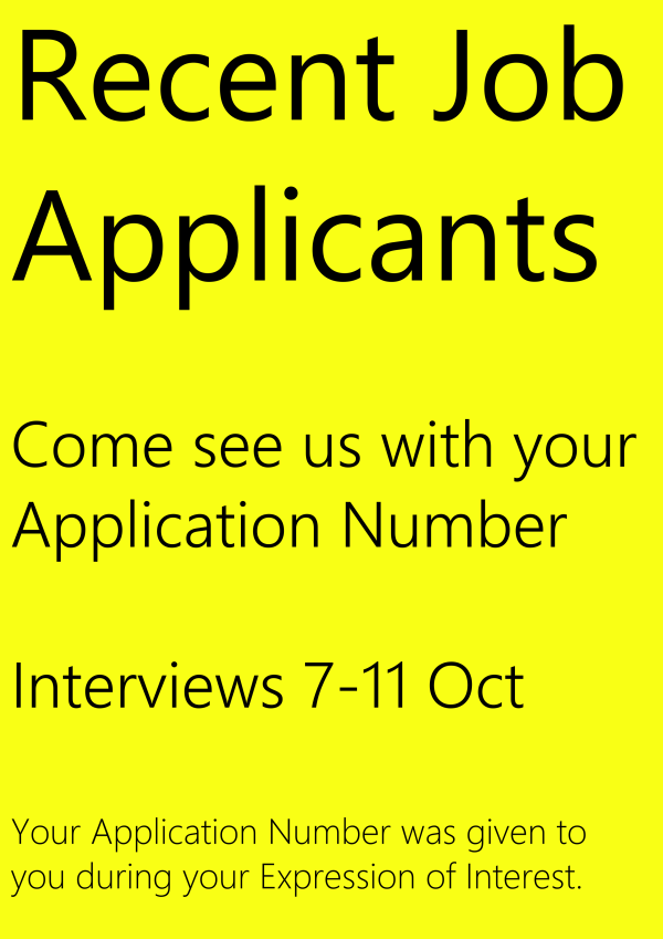
Thinking about the figure-ground relationship can help us with design goal 1. We can replace the dark red paper with a bright eye-catching colour, perhaps a luminous yellow. This won’t look particularly “pretty”, but “pretty” is not one of the design goals at the moment.
Assuming this new paper stock, we can start to think about the typography by creating a basic hierarchy of size that relates to the design goals.
Here’s a quick mock-up showing a potential starting point for the design:

I didn’t use a grid for layout or worry about typographic rhythm etc on this mock-up but it’s miles ahead of the original and seems to fulfil the design goals.
I’ve taken a few liberties with the copy and removed some wording and re-worded a few things. I’ve removed what (I’m guessing) is probably unnecessary content in order to focus on the main points to fulfil the design goals.
I don’t think this new design is particularly attractive, but would probably be more effective than the original at communicating the required message.
(If you’d like to learn more about design principals, typography, and colour choice, check out my Pluralsight Introduction to Design course.)
SHARE: