The Gestalt Principals help us to understand human perception. The application of these principals can help us create better user interfaces and improve the overall user experience.
The Problem
Peregrine is a great free Twitter client for Windows Phone, although I love Rowi as well the last time I changed my Windows Phone handset I decided to give Peregrine a go and haven’t looked back.
I was using it this morning and noticed someone had mentioned that they were watching my new Pluralsight course. It also looked like this was a retweet.
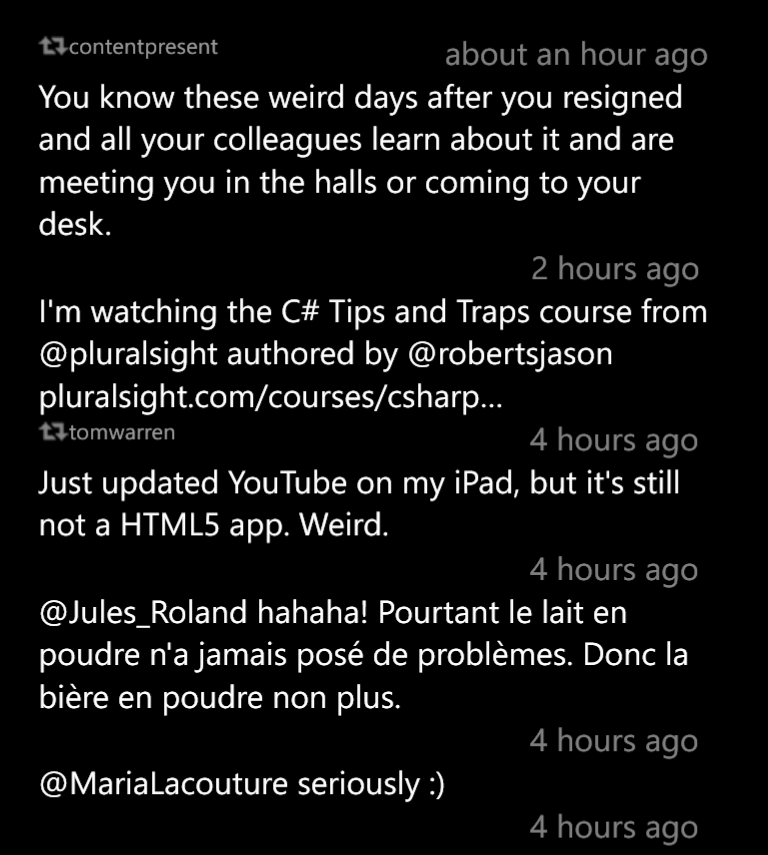
Look at this screenshot:

I thought the Tweet that I was mentioned in was a retweet from tomwarren.
It’s not; the retweet indicator belongs to the tweet below: “Just updated YouTube…”.
So what are some of the ways we can solve this design problem?
Applying the Gestalt Principle of Proximity
The Principal of Proximity suggests that things that are near one another seem more related.
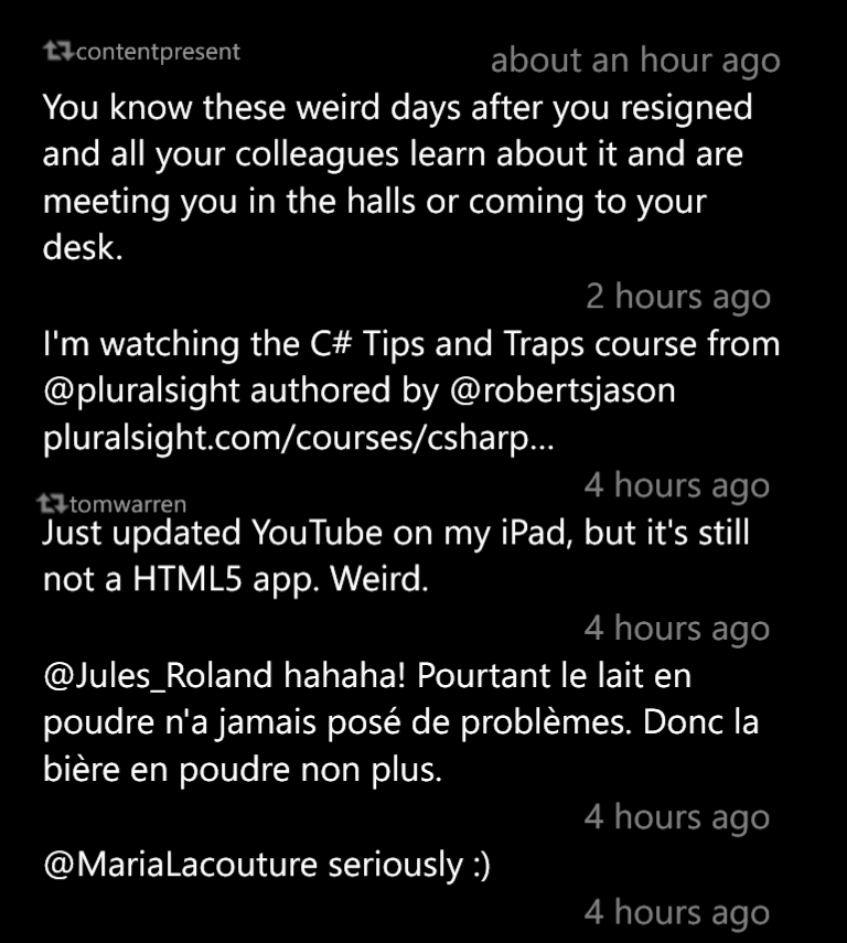
We can apply this principal by moving the retweet indicator closer to the Tweet that it belongs to to.
I’ve mocked-up what this could look like in this image:

Notice that we immediately sense a closer relationship between the Tweet and the retweet indicator that belongs to it.
Applying the Gestalt Principle of Uniform Connectedness
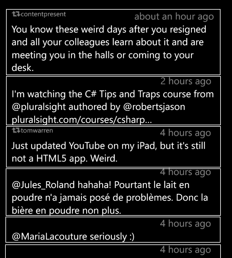
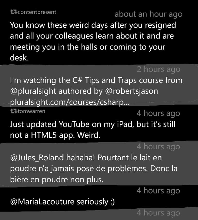
Another option is to apply the Principal of Uniform Connectedness. This principal helps us group related information by applying uniform visual properties. Two simple ways to apply this are to draw a box around the related things or to have related things sit on a common background.
This mock-up shows the application of Uniform Connectedness in box form (I’ve reset the proximity of the retweet indicator back to the original):

It’s now super clear (if not particularly attractive) which groups of information are related.
Another option is to use alternating background colours as in the mock-up below:

Again it’s now a lot clearer which groups of information are related.
I hope this to be the start of a series where design principals are discussed in the context of real world examples.
If you want to learn more about the Gestalt Principals and other design related things such as Typography and colour choice, feel free to check out my Pluralsight Introduction to Design course.
SHARE: