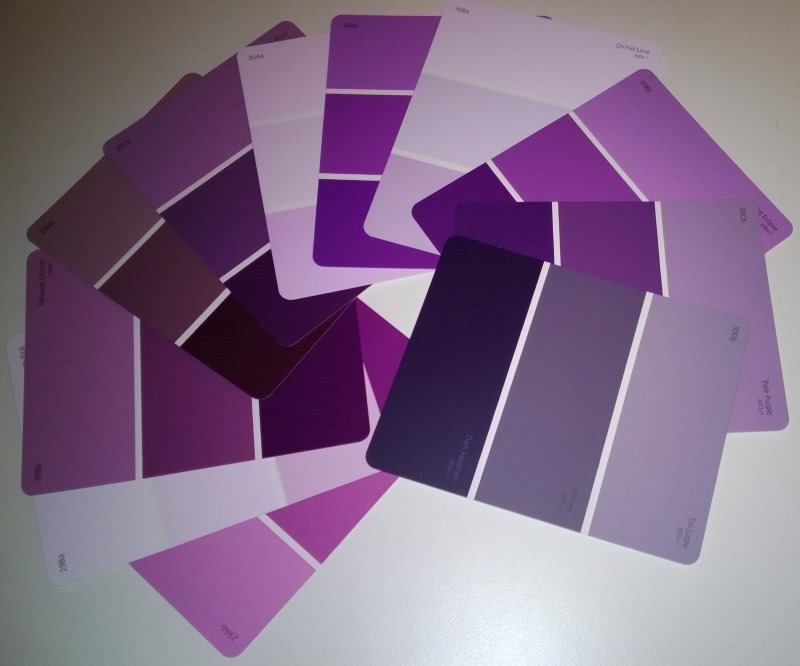
When designing an app or website it can be hard to come up with inspiration for colour ideas. One place to look is the local hardware/DIY store.
These stores usually have colour sample cards from the different paint manufacturers that are sometimes helpfully grouped into related/complimenting shades.
This image shows some cards from my local hardware store showing some purple and pink hues.

While it’s a low tech approach, it’s cool to see a whole load of colours “in the flesh” when these cards are laid out on the display stands.
If you’d like to learn more about colour choice and other design related topics such as Typography, check out my Pluralsight Introduction to Design course.
SHARE: