This article shows one way of choosing and using a colour scheme in your Windows Store app.
The default style looks like this:
Step 1 – Choose a Colour Palette
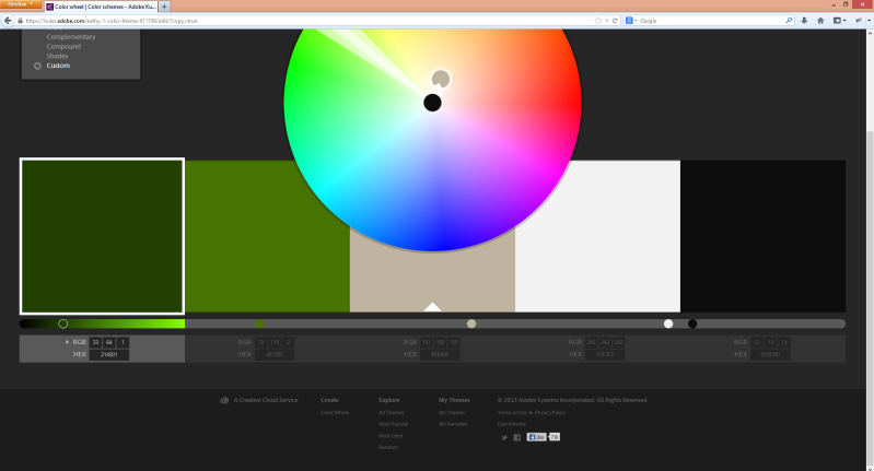
We can use our fave colours or use a tool such as Adobe Kuler to help us come up with a scheme.
The screen shot below shows a Kuler theme “kathy 1” and it’s RGB values.
Our styled app will contain these colours.
I’m going to select three to use, but you can have as many colours in your palette as you need.
The dominant colour that will be used as the background colour will be the middle colour in the screenshot, which is a kind of a grey.
The subdominant colour will be the lighter green, this is the 2nd from the left in the screenshot. This will be used for copy text etc.
The accent colour will be used to highlight things, for this I’m choosing the off-white.
Step 2 – Setting Up Our Colour Resource Dictionary
In XAML, resource dictionaries are places we can put things (such as styles, etc.) that can be reused throughout our app.
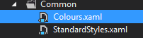
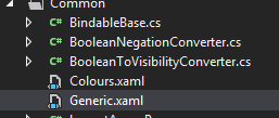
Using the Visual Studio template we get a StandardStyles.xaml file created for us in the Common folder.
In this Common folder, we create a new resource dictionary called Colours.xaml:
This is where we will set up our basic palette colours. The xaml looks like this:
<ResourceDictionary
    xmlns="http://schemas.microsoft.com/winfx/2006/xaml/presentation"
    xmlns:x="http://schemas.microsoft.com/winfx/2006/xaml">

    <Color x:Key="ThemeDominant">#FFBFB49F</Color>
    <Color x:Key="ThemeSubDominant">#FF467302</Color>
    <Color x:Key="ThemeAccent">#FFF2F2F2</Color>

</ResourceDictionary>
Here, we’ve defined 3 colour resources and given them names ThemeXXXXXX. The RGB hex values we get from Kuler:
Step 3 – Stop, Hammer (Pants) Time
We could go and restyle all the styles for all the default controls by hand, but this is not much fun.
Or we can use a handy open source utility called HAMMER.Pants.
This is a command line tool that we can give a colour and it will spit out a xaml file with all the 4802 lines of standard control themes but using a colour we supply.
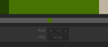
So if we use out subdominant colour (green-ish) we’d execute: “hammer.pants.exe /colour=467302” where 467302 is the RGB hex value (again we get this from Kuler).
This will generate a Generic.xaml file for use.
Next we add this file to our Visual Studio solution under the Common folder:
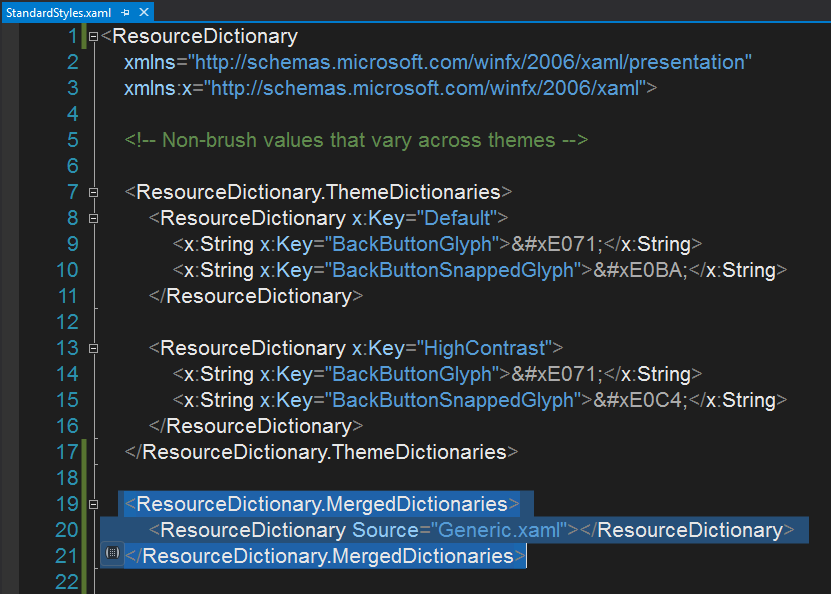
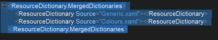
If we run the app now nothing will have changed because we need to make the app use these new xaml resources in Generic.xaml. We can do this by merging them including them in the StandardStyles.xaml:
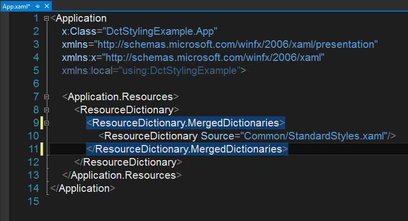
The StandardStyles.xaml is already referenced in our App.xaml:
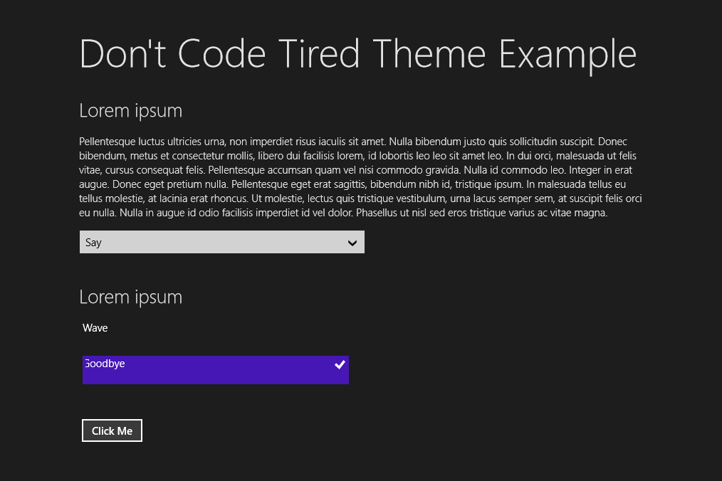
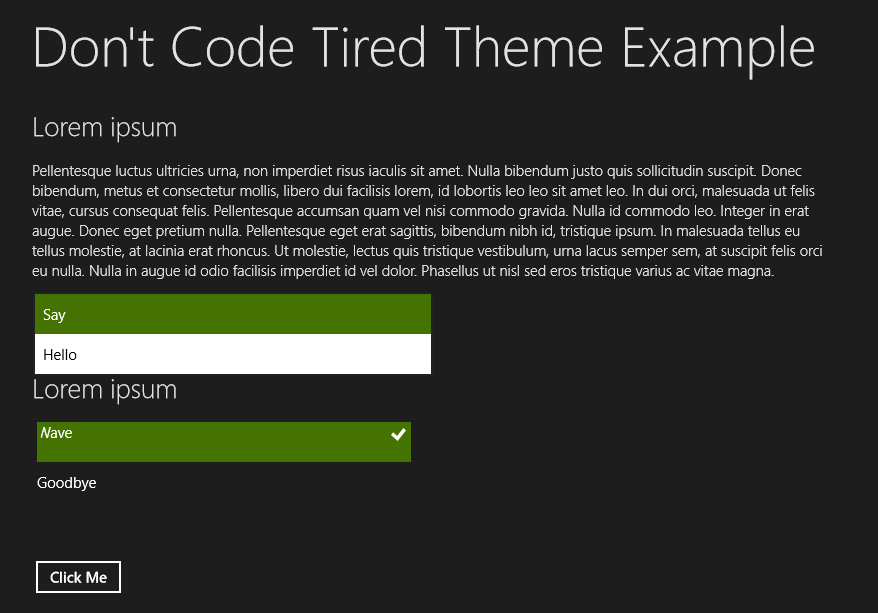
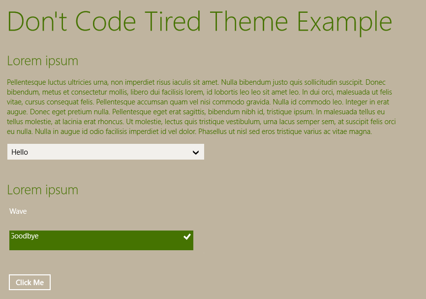
Now if we run the app, notice the green styled selections:
Step 3 – Overriding Other Default Colours With Our Own
Now we have our controls styled we want to override some other things such as the background colour.
First we need to make use of our Colours.xaml file that we created earlier.
We can reference this in our StandardStyles.xaml:
Now we can start to redefine some of the default theme things.
In the StandaryStyles.xaml we can add 2 lines:
<ResourceDictionary.MergedDictionaries>
    <ResourceDictionary Source="Generic.xaml"></ResourceDictionary>
    <ResourceDictionary Source="Colours.xaml"></ResourceDictionary>
</ResourceDictionary.MergedDictionaries>


<SolidColorBrush x:Key="ApplicationPageBackgroundThemeBrush" Color="{StaticResource ThemeDominant}"></SolidColorBrush>
<SolidColorBrush x:Key="ApplicationForegroundThemeBrush" Color="{StaticResource ThemeSubDominant}"></SolidColorBrush>
These override the ApplicationPageBackgroundThemeBrush to our dominant colour and the ApplicationForegroundThemeBrush to our subdominant.
If we run the app we can now see our colours being used:
And we then continue to override any styles that we like, for example if we want our buttons to use our subdominant colour when they’re hovered over we could add:
<SolidColorBrush x:Key="ButtonPointerOverBackgroundThemeBrush" Color="{StaticResource ThemeSubDominant}"></SolidColorBrush>
Which would make the button look like this:

(If you’re developing a Windows 8 app and you’d like to learn more about how to choose features for version one of your app, etc check out my Designing Windows 8 Apps Pluralsight course.)
SHARE: