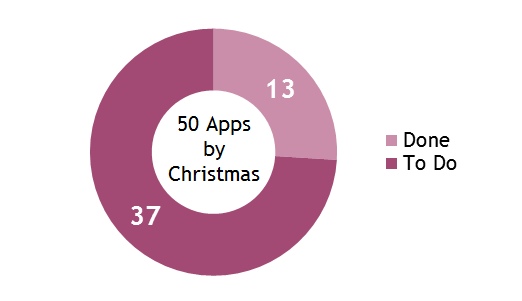
This article is part of the 50 Apps by Christmas series

Color Eye is a Windows Phone 8 app that creates colour schemes by sampling live data from the camera.

Working with Live Camera Data
As I’d not worked with the camera in a Windows Phone app before I needed to learn the basics. One of the best sources to get up to speed on a particular specific topic are the samples. I started with the Camera Grayscale Sample to learn how to “pump” the values from the camera and how to get an array of colour values.
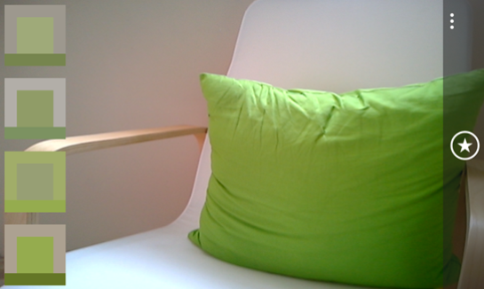
Color Eye allows you to create colour schemes by sampling different points from the live camera image, to create a scheme that can be saved and shared:

To create the colours, it’s no use just sampling 3 individual pixel values in the image, rather an average of a configurable square of pixels is used.
I created four configurations of the “colour sample sets” and created a user control to represent the colour scheme.
The colour average algorithm is pretty basic, just averaging the individual red, green, and blue components and combining these averages into a final RGB value. A more complex (and more CPU-intensive) method could be to convert to another colour space such as LAB and do the averaging, then convert back to RGB.
Data Storage
The user can capture and save schemes for later viewing and sharing, so I needed a local storage mechanism. I decided to go with SQLite.
There’s a few moving parts to getting SQLite working in Windows Phone apps, but this post on the Nokia dev wiki was of great help and is recommended if you’ve never used SQLite before. Pay attention to the "Any CPU" problem section.
Monetization
Working out how to monetize apps is hard. I decided for this app to not use ads. Instead I decided to go with the try/buy model.
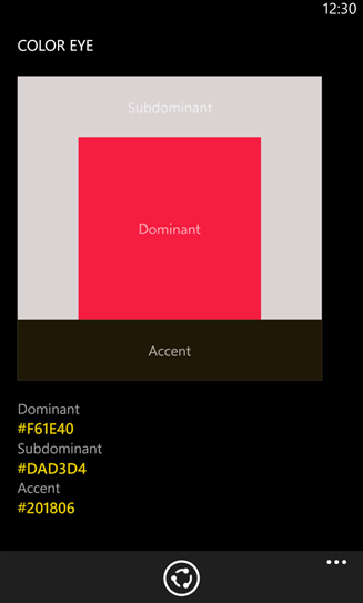
The trial version allows the capturing and saving of a maximum of three colour schemes. The trial version also doesn’t allow sharing of RGB values or scheme image. Users can sill see the RGB hex values if they want to use them in design projects.
When a user exceeds these trial limitations, a message is displayed that asks if they want to buy the full version.
I set the full priced version at $4.49 which is moderately high for an app. The thought here being that the app is fairly niche, so the potential pool of users is lower; thus to make money each sale has to maximise the income. It’s hoped that designers won’t mind paying this much as it’s both a fun app and also potentially useful in commercial projects.
It will be interesting to see how this pans out, and I may do some pricing experiments once it’s been out for a little while.
I also have some ideas for future features that will further differentiate the full paid-for version.
Testing
For this kind of app, testing on an actual device is crucial as the emulator doesn’t really cut it – at least not for the live image capture part. I only have a single Windows 8 Phone to test on, ideally I would have liked to test on a range of physical devices.
Initially I had the four capture scheme buttons on the right of the screen, but trying to use the app on a physical device proved that this was not very comfortable to use, so I moved them to the left side. Again, testing solely on the emulator wouldn't have revealed this usability aspect of the original design.
You can download the trial version now.
SHARE: