Paper Prototyping Templates for Windows 8 Apps

Sketching out designs and creating paper prototypes can help to visualise your app and correct design mistakes earlier and before coding begins. To help with this I've produced the following paper prototype templates to help (right click & save):

Windows 8 Paper Prototype template - full screen mode

More...

SHARE:

The Enterprise Re-Imagined with Windows 8

If your company is currently in the process of upgrading to Windows 8, do they see it as a simple OS upgrade to keep up to date; or, do they see it as an enabler to re-imagine how the business operates?

Windows 8 offers the potential to streamline business processes, lower costs, and offer additional customer service opportunities

With an internal app store, domain-joined tablet PCs and innovative leadership, Windows 8 can offer the potential to streamline business processes, lower costs, and offer additional customer service opportunities.

Multiple Internal Apps

Refactoring Legacy Applications

Most companies without excellent software development practices and management end up with big, kitchen-sink. costly-to-maintain software systems.

Internal-facing corporate Windows 8 apps offer a solution to this problem.

More...

SHARE:

Getting Ready to Build Your First Windows 8 App

This article outlines an approach to getting started building you first Windows 8 app, but rather than focus on the technology aspects it focus on the pre-coding activities.

The Idea

So you have a few ideas for your first app, but how do you decide which one to build? It depends on what you want to get out of it. If you want to use your first app as a learning experience or to get some app building experience on your CV then you may not be concerned with monetisation.

Monetising you App

If you are attempting app building as a means of income generation then you’ll want to consider what monetisation options Windows 8 gives you:

  1. Paid app
  2. Free app with adverts
  3. In-app purchases*

*You can also use in-app purchases with paid or free apps and with or without ads.

Regardless of app type, you should offer a version of the app without ads for those people who really dislike them.

The Appeal Spectrum

One way of deciding which app idea to build is to think of its potential appeal. If you imagine this appeal as a spectrum from widest appeal (think Facebook, Twitter, etc.) to those with limited appeal (specialist niche apps, etc.).

On top of this spectrum we can add some potential income factors: will millions of people pay hundreds of dollars for the app, or will millions of people pay a dollar for the app?

More...

SHARE:

Designing Mobile Apps

I've authored three Windows Phone 7 mobile apps. This is not a huge number I know but I would like to share how I think about mobile app design. The workflow below is not limited to any particular platform and can be applied to Windows Phone, iOS, Android development or at a push Blackberry ;)

Step 1: Stop and Think

It's so easy to break open an IDE and start hacking together your app, especially if you're using great developer tools such as Visual Studio and Expression Blend. Shutdown your computer, grab a cup of coffee, sit down and think.

thinking does equal working

As a developer I have to force myself to do this, which is why shutting down your computer is a necessity! More...

SHARE:

Redesigning DontCodeTired.Com (Part 11) - Conclusion

The redesigned Don't Code Tired is now live. This article wraps up the series with a look back at what I learned and what things are still outstanding.

Key Things I Learned

I am not a designer. Ok so I knew this anyway, even though I learned heaps from this process if I were to undertake it again I would at least get some feedback along the way from a designer.

I love SASS

CSS Media Queries are awesome. It is so easy to apply different styling based on browser width, the hard bit is deciding what you want to show

I Love SASS. SASS really does make writing CSS a more pleasurable experience. Even though I feel I have only just scratched the surface of what is possible I am hooked and will be using SASS on any project I can in the future.

Other Learnings

  • Design concepts such as: mobile-first, typography-out, designing with personality, content inventories, etc.
  • Basic colour theory
  • Controlling mobile browser rendering and zooming with meta tags
  • Custom fonts using @font-face
  • New semantic HTML5 elements
  • ARIA Landmark Roles

Evaluating the Final Design

I though it is good to look at the final outcome and compare it against what I initially set out to do.

Voice

"DontCodeTired's voice is friendly and personal, it's speech-like and somewhat casual using contractions and occasional slang over formal and stuffy speech. It doesn't try to be overly cool but is not afraid to have some fun on occasion (as long as it doesn't detract too much from the information)."

I think the the voice of the messages, prompts, navigation, etc. upholds this design goal. Some existing articles in the blog may not, but I should refer to this when writing future articles.

Colour

"DontCodeTired's colours are clean and mostly understated. Where colour highlights are needed they are saturated and bright. Solid blocks of colour are preferred to gradients."

There are no gradients in the final design, but the final colours I chose are not "understated", quite the opposite the purple is quite bright. I'm not sure how I feel at this stage, I may revisit the colour palette at a later date, but due to the awesomeness of SASS I can just change a few variables and the whole colour scheme will be updated.

Typography

"DontCodeTired is all about the article content. Main content typography will use clean readable sans-serif fonts with a predictable type ramp. DontCodeTired's overall design will be based heavily on the readability of text."

The chosen fonts meet the above brief, if I have one criticism it's that the type ramp for headings could be a little better. The first few heading levels are good, but at the lower levels there is not much difference in size.

General Style

"Taking some ques from Metro design, interface elements will mostly focus on content over chrome, elevating the article content to the fore, relegating non important navigation and other elements to the ground."

This design goal has been well respected throughout the design. There are not a lot of boxes to "constrain" content, instead proximity and relative size are used to group content.

Other Observations

  • There is too much empty space in desktop version in the header
  • The header colour may be too bright
  • Tweet button on the home page is showing the same value for each post
  • Max width should look prettier once the browser expands beyond this point, perhaps centred or other design element to fill the space
  • The SASS needs refactoring
  • Content still transmitted to mobile devices even when not shown
  • Loading speed on mobile devices needs to be quicker, especially the first page. This may need some CSS and JavaScript bundling and minification. The number of posts on the first page may also need to be reduced
  • Tag cloud and "things I've built" section need to be able to be accessed somehow on mobile devices where the sidebar is hidden

SHARE:

Redesigning DontCodeTired.Com (Part 10) - Creating the Remaining Responsive Breakpoints

Creating the Second Responsive Breakpoint

The next responsive breakpoint kicks in at 970px width. At this point the first of the sidebars become visible. This "about me" sidebar contains a basic bio and the last tweet I made, in addition to some advertisement space.

The tone of this sidebar is muted (other than the ads) with grey text and a black and white bio photo so as not to detract too much from the main article content.

I think the measure (length of horizontal line of text) becomes a little long before this break point kicks in, but is an acceptable compromise.

Creating the Third Responsive Breakpoint

The third breakpoint kicks in at 1200px. It introduces the second of the sidebars on the left side.

This sidebar contains common blog-type widgets such as tag clouds and links. Again the text is muted so as to not detract too much from the main content.

Defining a Maximum Width

As the width continues out from the third breakpoint the measure becomes increasingly long. Left unchecked the readability quickly becomes poor as the eye has a long way to travel from the end of one line on the right to the start of the next line on the left.

At some point a maximum point is reached where the text should no longer expand. This point occurs at 1470px, which still allow a pretty long measure but again is somewhat of a compromise. This is defined in the CSS using:

html {
max-width: 1470px;
}

At some point I might make the whole body centre aligned but for now I'm ok with this.

Using SASS to Style Tag Cloud Text Sizes

The blogging engine I'm using renders the tag cloud by adding classes to the items depending on the prominence of those tags in posts. Whilst I could have simply hard-coded the font sizes in these, it looked like a good opportunity to use SASS.

First I defined a couple of SASS variables, one to set the base font size for the least frequent tags, another to set what the increment is between each size. Then it's just a matter of multiplying the base size by a multiple of the increment. This enabled me to play with different combinations really quickly to get the look I wanted.

The final chuck of SASS looked like this:

$tcBaseSize: 0.5;
$tcIncrement: 0.3;
.tagcloud a.biggest {
@include font-size($tcBaseSize + (4 * $tcIncrement));
}
.tagcloud a.big {
@include font-size($tcBaseSize + (3 * $tcIncrement));
}
.tagcloud a.medium {
@include font-size($tcBaseSize + (2 * $tcIncrement));
}
.tagcloud a.small {
@include font-size($tcBaseSize + (1 * $tcIncrement));
}
.tagcloud a.smallest {
@include font-size($tcBaseSize);
}

Styling the Bullet Points in Unordered Lists

I wanted to change the bullet points from the default black circle to a coloured square as a nice visual embellishment.

The problem is that other than using images for bullets, this can be hard to do in CSS. Also I needed the solution to work with all the old posts that used unordered lists.

The solution I came up with (whilst a bit of a hack) seems to work nicely with the above constraints.

The solution involves using some jQuery to find all the <li> elements, and inject a <span> to wrap the inner content. This span has an inline style applied to set the colour to the that used by the rest of the article copy.

function wrapListItemContent() {
var standardTextColor = $("#hiddenTextColorJQueryHook").css("color");
$("ul li").each(function () {
var t = $(this);
t.html('<span style="color: ' + standardTextColor + '">' + t.html() + "</span>");
});
}

The hiddenTextColorJQueryHook is an element that I inject whatever SASS colour variable I'm using, so that if I change the SASS colours there will be no change required in the JavaScript.

The downside of this approach is the bullet points and text will appear coloured until the jQuery document ready fires. I may decide to pull this once I get into final device testing.

Screenshots of the New Breakpoints


SHARE:

Redesigning DontCodeTired.Com (Part 9) - Creating the Design for the First Responsive Breakpoint

At this point in the redesign process the mobile layout and design is (mostly) complete. The next stage of the process is to look at "non-mobile" designs.

Again I am going to take a typography-first approach. What this means is looking at the font size, measure, etc. at different browser widths and trying to maintain a nice reading experience as the width increases.

Responsive Breakpoints

A response design breakpoint is that point where one set of CSS styles takes over from another. Each breakpoint represents potentially different layout, styling, content and functionality. Responsive breakpoints are implemented using CSS3 media queries that enable a different set of CSS to be applied depending on the size of the window.

A response design breakpoint is that point where one set of CSS styles takes over from another.

As I am thinking typography-first, I will let the breakpoints occur naturally where they arise rather than designing up front. I'll be doing in-browser design rather that mockups in a drawing or prototyping application.

A good guide (see below for recommended tools) for the different resolutions is the Chrome Window Resizer plugin.

Will it Look Good on an iPad?

It's not a good idea to think of individual devices because we don't want to have device-specific renderings; this is not sustainable or maintainable: every time a new device is released we would have to create a breakpoint for it.

If the user has a browser that supports media queries then we can write CSS specifically for certain situations

We can however look at the resolution of an iPad (for example) and add this to the Window Resizer plugin to give us another useful reference point. I have added a 1024 x 768 (iPad landscape) and 768 x 1024 (iPad portrait).

Arranging the CSS (SASS)

Currently I have a 0-up.scss SASS file that generates a 0-up.css file. This is being included and is not surrounded by a conditional media query. This means that these styles will always be used, unless they are overridden by styles that occur later in the CSS.

The styles that are specified later on will be surrounded by media queries that represent the responsive breakpoints in the design.

The First Responsive Breakpoint at 768px

At 768 pixels wide the measure (of the text) is still nice as is the font size. The thing that I want to introduce at this breakpoint is a change in the header.

I want to replace the drop-down select box with simple hyperlinks. I also want to add the search box into the header.

Creating a Breakpoint Using CSS Media Queries

The first thing we need to do is create a new (SASS) stylesheet to represent the styles that will be overridden, i.e. 768-up.scss.

The first thing in this stylesheet is to create the media query:

@media all and (min-width: 768px){
}

Weirdly, the Chrome Window Resizer seems to incorrectly report the width so at 768px the media query didn't kick in (I testing this by adding html { background-color: black;} and using the plugin to change to 768px, but the background was still white.

Some other tools I tried:

Hiding the Drop Down Select Menu

In the 768-up file:

@media all and (min-width: 768px){  
#menuNavSelect{
visibility: hidden;
display: none;
}
}

Showing the Hyperlink Navigation

In the 768-up file:

@media all and (min-width: 768px){  
#menuNavSelect{
visibility: hidden;
display: none;
}
#menuNavList {
visibility: visible;
display: block;
}
}

Showing the Search Box

It's at this point that the idea of having multiple SASS files to represent the breakpoints becomes problematic. The problem is that if we want to use any of the mixins or variables that are defined in the 0-up.scss file we would have to copy and paste them creating a maintenance overhead.

There is an import rule is SASS that can import another .scss file but it looks like it imports as plain CSS if there are any media queries.

So rather that have separate SASS files for each breakpoint, I've decided to have one SASS file, inside which all the media queries will be defined.

To show the search box, in the 768-up section of the scss file we add some styling for headerSearchContainer:

@media all and (min-width: 768px){  
#menuNavSelect{
visibility: hidden;
display: none;
}
#menuNavList {
visibility: visible;
display: block;
}
#headerSearchContainer {
visibility: visible;
display: block;
}
}

These are the only changes I want to make at this breakpoint. I may makes some tweaks later, but for now this is fine.


Screenshots from the awesome Responsinator


SHARE:

Testing Responsive Web Designs and Layout

CSS3 Media Queries enable us to have different layouts and show/hide content based on the width of the browser or device the page is being displayed on.

Typically you will have a number of Responsive Design Breakpoints that say something like: "when the screen width is less than 800px hide this, otherwise show this... etc". So we need some way to test how the page will look at a given width.

During the (ongoing) redesign of DontCodeTired I needed a way to test the site at different screen widths.

I tried a number of different tools, the two below are the ones that worked the best for me:

Firefox Nightly

Firefox Nightly is a pre-release version of Firefox for testing purposes only. It has a new awesome feature called Responsive Design View that will hopefully make it into the 'real' Firefox one day.

After you install, go to Tools -> Web Developer -> Responsive Design View. This will enable you to resize the 'internal' window to a custom size, or choose from one of the presets. The image below shows  a locally running website at 320x480:


The Responsinator

Apart from having an awesome name, The Responsinator is a website that allows you to visualise how a page will look on a given number of harware devices such as iPad, "Crappy Android landscape", etc. It's a nice tool tool to get a high-level overview at points throughout the design process but it's probably not as good as Firefox Nightly for quick testing. It also doesn't allow custom sizes, but it's still a great tool for visualisation. You can also use it with local or remote sites. The image below shows The Responsitator showing a local site (I've zoomed out the browser so you can see more devices): 


Some Other Tools

SHARE:

Redesigning DontCodeTired.Com (Part 8) - Visual Styling

Now I have all the elements in place (semantic HTML5, typography, copy) in place I can start to think about the visual styling and decoration.

The first thing is to refer back to the initial Design Persona Visual Lexicon:

"DontCodeTired's colors are clean and mostly understated. Where color highlights are needed they are saturated and bright. Solid blocks of color are preferred to gradients."

Bearing this in mind I came up with a list of style attributes that I want the visual design to posses:

  • light
  • spacious
  • digital
  • clean
  • crisp
  • bright
  • saturated color
  • open
  • simple

Choosing a Color Scheme

This step is about creating a set of colors that will work together in the design.

Color is a powerful tool that will set the overall tone of the site. There is a whole psychology of color which I would love to learn more about, but this color wheel gives a good idea, what's really interesting is the cultural-specific attitudes to colors.

Looking back at the brand traits from part 2:

  • knowledgeable but not condescending
  • clear but not elitist
  • valuable but not limited
  • friendly but not chatty
  • honest but not mean

As we want a sense of friendliness, the first color to rule out are the reds. Reds signal danger (for example blood is red) so it's a very strong color and according to the color wheel is also associated with aggression.

The knowledgeable and honest traits suggest pinks (truth), purples (wisdom), blues (wisdom) and browns (credibility). Comparing these candidate colors to the style attributes above (particularly bright and saturated) rule out the browns.

The honest brand trait leads us to pinks (truth), yellows (honor) and again browns (credibility).

So, in addition to black (which I have already decided for the main article content) and white (for the background), I have the following candidate colors:

  • pinks
  • purples
  • blues
  • yellows

Using a tool like Kuler I can now start to put together some color swatches.

Below is an initial attempt at some color schemes:


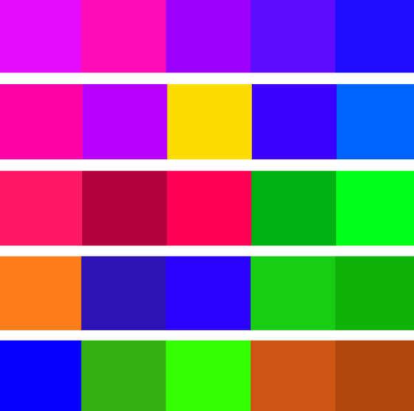
Interestingly, when playing with the different color rules some of the colors I had thought not to use appeared, such as browns and greens. I think it's important to remain open-minded throughout the design process so it's ok to explore variations.

In the case of the greens I think this still fits into the overall feel I'm trying to create and the greens bring a sense of nature to the design. This natural feeling is somewhat at odds with the digital style attribute I outlined above, however I think the 2 can co-exist and the greens may offer a nice counterpoint.

I especially like the first and third schemes in the above image, however I don't think the first one offers enough contrast. I tried adding a green and slightly changing the hue/saturation of the others to get this:


Whilst there is a bit more contrast in this it still doesn't feel right. I know that is a very non-technical description, and I'm sure I have violated numerous color rules, but it doesn't feel very integrated and feels to me somewhat confronting or distant or disingenuous.

So I went back to scheme three and tried adding a purple into it:

Again this didn't seem right to me and scheme three kept calling out to me for some reason, so although I tried different permutations I'm going with my gut feel:

Using SASS to Define Colors

The awesome SASS let's us define variables, which includes variables to represent colors.

Defining Basic Background and Foreground

The first colors that need defining are the default background and foreground text. The background will be pure white, with the foreground text being an almost-black (to soften and slightly reduce the contrast) and make text a bit easier on the eye)..

$primaryContentBgColor: #FFF;
$primaryContentTextColor: #333;
html {
background-color: $primaryContentBgColor;
color: $primaryContentTextColor;
}

All Monitors Are Not Equal

Up until this point I've been using an Acer monitor plugged into my Lenovo X220T as my main screen for Kuler and playing with colors. An interesting thing happened why I viewed the colors on a physical Windows phone and on the laptop monitor. The colors were really different, with what I though were purples coming out as pinks.

This again highlights the importance of testing on actual devices early on.

Ideally I would calibrate all my screens with a hardware colourometer such as the Spyder. Obviously this would be basic requirement if I were a professional designer...

This is what the final color palette looks like when adjusted from my laptop screen and checked on a physical phone:

Defining The Other Colors

Up until this point I've mostly been doing in-browser design, i.e.using HTML and CSS to create wireframes\mockups. This enables early feedback of any potential browser problems and means that rendering of text is more realistic than if a graphics program is used.

At this point it makes some sense to open up an image editor (for example the free Paint.NET and throw around some colors. I added in the Kuler colors into Paint.NET palette as custom colors and then played around with different combinations just to get an initial feel for how I wanted to use the 5 colors, plus black and white.

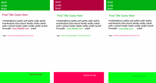
Out of these three color concepts I've chosen to go with the right most one initially. The great think about using SASS color variables is that it's going to be super easy to change colors if I change my mind later.

Designing a Logo

So now I have a color concept I can think about a logo. I am not a graphic artist, so I am going to stick with a basic text-based logo which will work out better for everyone concerned.

To allow me to 'generate' logos at different sizes with no loss of quality I need to use a vector based format, rather than bitmap format. The free Inkscape allows creation and saving of vector based images in SVG format. The added advantage is that I might choose to use a native SVG file in the browser rather than rendering down to a raster image like a PNG.

Some initial design ideas:

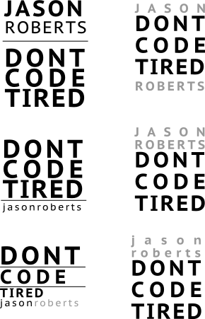
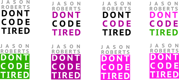
Out of these I picked the one I liked the most and started to play with some theme colors:

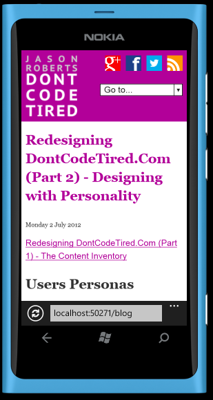
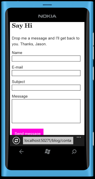
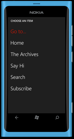
The Finished Mobile-First Design

I consider the mobile design to be (mostly) complete, here's how it looks in Windows Phone emulator:


SHARE: