CSS3 Media Queries enable us to have different layouts and show/hide content based on the width of the browser or device the page is being displayed on.
Typically you will have a number of Responsive Design Breakpoints that say something like: "when the screen width is less than 800px hide this, otherwise show this... etc". So we need some way to test how the page will look at a given width.
During the (ongoing) redesign of DontCodeTired I needed a way to test the site at different screen widths.
I tried a number of different tools, the two below are the ones that worked the best for me:
Firefox Nightly
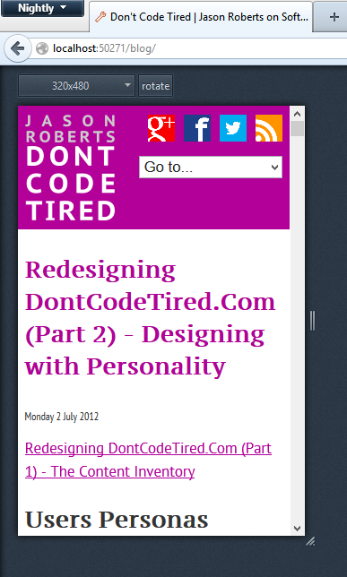
Firefox Nightly is a pre-release version of Firefox for testing purposes only. It has a new awesome feature called Responsive Design View that will hopefully make it into the 'real' Firefox one day.
After you install, go to Tools -> Web Developer -> Responsive Design View. This will enable you to resize the 'internal' window to a custom size, or choose from one of the presets. The image below shows a locally running website at 320x480:
The Responsinator
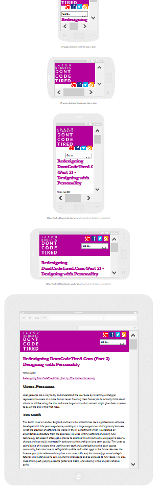
Apart from having an awesome name, The Responsinator is a website that allows you to visualise how a page will look on a given number of harware devices such as iPad, "Crappy Android landscape", etc. It's a nice tool tool to get a high-level overview at points throughout the design process but it's probably not as good as Firefox Nightly for quick testing. It also doesn't allow custom sizes, but it's still a great tool for visualisation. You can also use it with local or remote sites. The image below shows The Responsitator showing a local site (I've zoomed out the browser so you can see more devices):
Some Other Tools
SHARE: