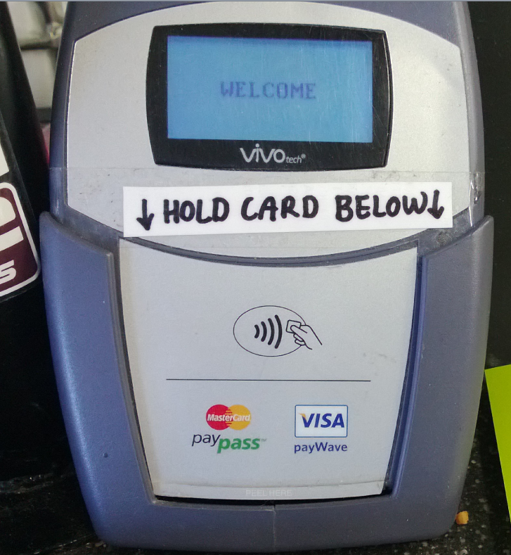
Take a look at this photo I took of a contactless style of payment terminal at a local grocery store. This is the kind of terminal that, with a compatible credit/debit card you can just tap, hover, or wave you card in front of the machine rather than inserting and keying in a pin number.
Notice the extra handwritten instruction taped to it: “HOLD CARD BELOW”.

The fact that the staff of the store had to modify the machine in this way gives us a clue that there may be a problem with the design. It suggests that some customers were holding their cards in the wrong place, perhaps at the top of the machine, and thus not initiating a payment.
We can see that the only perceived affordance of where to hold your card is the little diagram in the middle.
Whilst I’m not a hardware designer (and without perhaps performing some usability studies) I thought it would still be fun to mock-up some changes.
More...
SHARE:
It is with much excitement that my first ever Pluralsight course on Designing Windows 8 apps has just been released.
The course leads you through the process of capturing and evaluating ideas, choosing and prioritising app features, and onwards into actually designing the navigation experience, user interface, and integrating your app into Windows 8.
You can check it out now, if you don’t already have a Pluralsight subscription you can check out my course for free by signing up for the free trial!
SHARE:
With Windows 8 and the metro "Modern Windows New UI Store Experience Style" version of Internet Explorer 10, you can pin a web site to the start menu and provide a hi-res image to be displayed on the tile. This is a nice little touch to "delight the user" and requires very little effort.
There are also some cool things you can do to enable your pinned tile to display notification badges, though this requires a little extra work.
Customising the Pinned Site Tile Image
By default the tile that gets pinned to your start menu will either appear with the site favicon or the default Internet Explorer logo.

Either way it doesn't look super great.
You can create a larger PNG image and tell Windows 8 to use this hi-res image rather than the small lo-res favicon or default IE logo. The image must be 144px high and 144px wide and it's recommended by Microsoft that you use a transparent background.
More...
SHARE:
Deciding between writing native apps or "cross platform" HTML5 apps is hard. It's an increasingly relevant debate as mobile and tablet usage continues to increase.
As the usage of mobile devices is increasing, so too is the user expectation of an awesome experience
Some people will only ever access your service and brand via a mobile phone or tablet device.
As the usage of mobile devices is increasing, so too is the user expectation of an awesome experience.

(This article does not deal with games as they provide their own look and feel and interaction patterns.)
More...
SHARE:
I've authored three Windows Phone 7 mobile apps. This is not a huge number I know but I would like to share how I think about mobile app design. The workflow below is not limited to any particular platform and can be applied to Windows Phone, iOS, Android development or at a push Blackberry ;)
Step 1: Stop and Think
It's so easy to break open an IDE and start hacking together your app, especially if you're using great developer tools such as Visual Studio and Expression Blend. Shutdown your computer, grab a cup of coffee, sit down and think.
thinking does equal working
As a developer I have to force myself to do this, which is why shutting down your computer is a necessity!
More...
SHARE: