(This article is part of the Design Principals in Practice series)
We often take for granted, design principles that are in use in the real world; even in source code these principles affect out ability to comprehend the meaning.
I’m not talking specifically about clean code ideas such as well-named Booleans but rather source code at a higher, more visual level.
Let’s take a look at some design principles and how we can (mis)use them.
Proximity
The Gestalt principle of Proximity states that things that are closer to each other seem more related.
Take the following code, there is an automatic sense that method A and B feel related to each other:
public class Class1
{
    public void A()
    {
        //
    }

    public void B()
    {
        //
    }


    public void C()
    {
        //
    }
}
This is because they are in closer proximity to each other, method C feels more distant and unrelated.
The principle of Proximity can be used when declaring varaibles:
public void SomeMethod()
{
    bool isVipCustomer;
    int years;

    string x;

    decimal y;
}
Here,we get a sense that isVipCustomer and years are related, though years should be renamed to something like yearsAtVipStatus rather than relying on Proximity.
Proximity also applies to where variable are declared, for example the traditional approach of declaring them all at the top of the method (low proximity), versus declaring them throughout the method when the are needed (high proximity).
Similarity
Things that are similar in some way seem more related, this similarity could be in shape, size, color, texture, etc.
IDEs such as Visual Studio use similarity of color to help us perceive what a piece of code is; blue for keywords, green for comments etc.
Naming conventions in source code can increase or decrease the level of similarity to other pieces of code. For example, take the following code:
_firstName = "Sarah";
_lastName = "Smith";
fullName = _firstName + " " + _lastName;
Here we get a sense that _firstName and _lastName are similar somehow (they are fields in the containing class) Also notice here that I’ve deliberately removed whitespace, if we add some whitespace in we also get the principle of Proximity activated:
_firstName = "Sarah";
_lastName = "Smith";

fullName = _firstName + " " + _lastName;
Uniform Connectedness
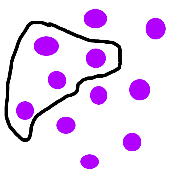
We can strongly increase the feeling of relatedness using Uniform Connectedness. For example:

In this image the dots enclosed inside the line feel strongly related.
In C#, code blocks contain groups of (hopefully) functionally cohesive code. So lines of code are contained inside sets of braces {}.
So, whilst this may be stretching the comparison a little, in some sense the braces are containing and increase the feeling of relatedness. Take the following example:
bool a;
bool b;
bool c;
bool d;
These Booleans feel related due to their proximity, but if we contain them in some additional braces:
{
    bool a;
    bool b;
}
{
    bool c;
    bool d;
}
We now see two strongly distinct groups.
In the age-old argument about one line code blocks in if statements:
if (true) Console.Write("true");

if (true)
    Console.Write("true");

if (true)
{
    Console.Write("true");
}
Whilst people have different opinions on the style here (I currently favour the explicit bottom approach), the bottom example exhibits strong demarcation of the logical condition and the code that gets executed. Though it’s also interesting to note the principle of Proximity in effect in the first example.
Symmetry
Humans tend to like the appearance of symmetry. One style of C# code that always appears jarring to my eyes is the use of unbalanced (asymmetrical) braces. In the code below the first if statement feels less symmetrical than the second:
if (true) {
    Console.Write("true");
}

if (true)
{
    Console.Write("true");
}
If you glance at these two versions (try to ignore the actual code) the bottom example feels more natural, more symmetrical; feel how your eyes are naturally drawn to the centre of the braces. There may of course be an aspect of conditioning here, if you read mostly C# code in the first style (you of course have my condolences) your mind may have become accustomed to it.
Conclusion
Out of all these principles, probably the easiest one to use is that of Proximity. Simply use whitespace to increase or decrease the relatedness of code. It’s amazing sometimes what a simple empty line can do to improve the readability of source code.
SHARE: