Affordance is a design property of a physical thing that suggests how it should be used. A ball affords rolling. A door handle affords pulling.
Whilst you can roll a cube, the physical properties of a cube less afford rolling than a ball. A ball better affords rolling than a cube.
You can push a door handle, but a door handle better affords pulling than pushing.
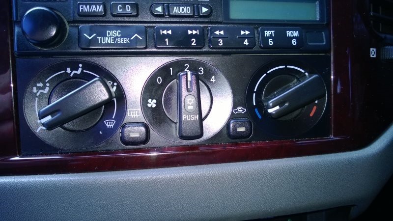
Take this photo of a car control console:

Notice the three circular dials. These dials afford turning. This is a photo I took in a friends car after I tried to figure out how to turn on the air conditioning.
I was looking for a button to press but was really struggling. My friend pointed out that I had to push the centre dial inwards to turn on the air con. Dials better afford turning than they do pushing so it wasn’t immediately obvious to me.
Notice that to overcome this weak affordance, the word “push” is printed on the dial. If I had continued looking I would have (eventually) found it, but it wasn’t a natural, organic place to look.
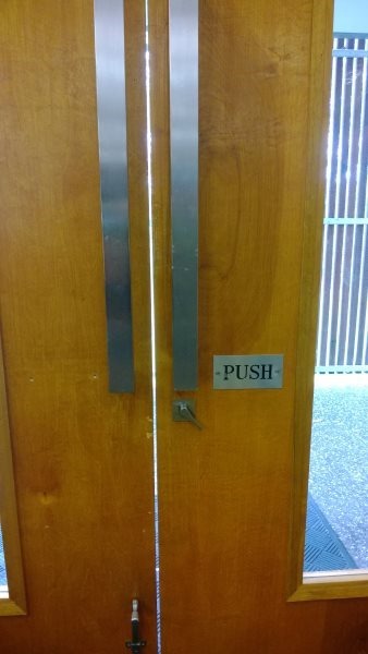
Take this photo of a door:

The long vertical silver handles better afford pulling than they do pushing. Because of this, we again see that some instructions have needed to be added to let people know to push the door rather than pull the handles. If the long handles were instead replaced with (perhaps wider) flat metal plates then these would better afford pushing than pulling. This might also mean that the “push” sign could be completely removed.
(If you want to learn more about design principals and related things such as Typography and colour choice, check out my Pluralsight Introduction to Design course.)
SHARE: