I found out about these units this week so I wanted to have a play with them.
The CSS units: vw, vh, vmin, and vmax allow sizes to be specified relative the the browser window size (or the “initial containing block”).
So 1 vw is equal to 1% of the viewport width and 1 vh is equal to 1% of the viewport height.
vmin and vmax return the smaller and larger respectively of vw or vh.
There is good support for vw and vh in modern browsers with some partial support for vmax, overall about 55% of browsers offer full support, 20% partial support.
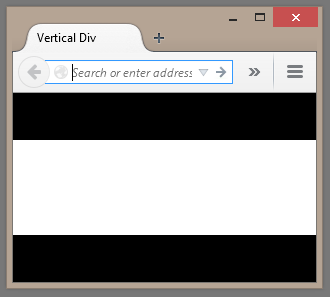
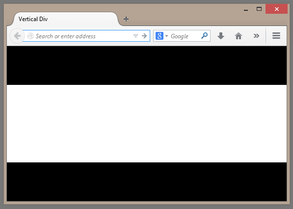
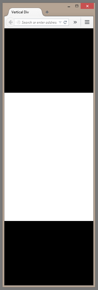
So for example to center a div vertically in the browser we could set its height to “50vh” (50% of the viewport height) and set its top margin to be “25vh” (or a quarter of the viewport height), thus leaving a quarter below the div.
So here’s a screenshot of this in action in a tiny browser window (the white is the div):

And after resizing the browser:

And after making the window tall and narrow:

And here’s the HTML:
<!DOCTYPE html>
<html xmlns="http://www.w3.org/1999/xhtml">
<head>
    <title>Vertical Div</title>
    <style>
        body {
            background-color: black;
            color: white;
            margin: 0;
            padding: 0;
        }
         div {
             height: 50vh;
             margin-top: 25vh;
             background-color: white;
             color: black;
         }
    </style>
</head>
<body>
    <div></div>
</body>
</html>
These units can also be applied to other things such as font size. This animated GIF below shows font-size set using vw and its tiny text with a really small browser window but the relative font size increases as the browser window size increases.

Checkout the docs for more info.
SHARE: