Taking a "mobile-first" approach, the initial work on styling will be for mobile devices, i.e. small screen resolutions.
Getting Started
In a previous post in this series I added the semantic HTML5 elements.
I'm going to be using SASS from this point onwards to generate the CSS.
I have taken a copy of the blog and hosted on my local machine, this means I can work with real content (blog posts) and hopefully encounter any problems much sooner than I could with fake Lorem ipsum text.
In the master page I have removed the reference to the existing style.css and replaced with a reference to 0-up.css. This file is essentially the 0-width-and-up CSS that will be rendered on mobile devices, eventually media queries will kick in to override these styles on desktop\tablet browsers.
The 0-up.css file is not edited by hand, instead it is compiled from the 0-up.scss SASS file.
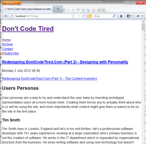
What the site looks like naked:
Hiding the Side Bar
So now we have some semantic HTML5 markup and an unstyled site (other than some CSS base/reset styles). The next step is to hide items such as the widget side bar that contains tagcloud, etc.
There will be times throughout the redesign that specific elements will need to be hidden, I've created a mixin. I can then just apply this mixin in any CSS rule.
The following is an extract from the 0-up.scss which shows a mixin being defined and then applied to hide the sidepanel div:
/* based on visuallyhidden style from http://html5boilerplate.com/ */
@mixin visually-hidden {
border: 0;
clip: rect(0 0 0 0);
height: 1px;
margin: -1px;
overflow: hidden;
padding: 0;
position: absolute;
width: 1px;
}
#sidepanel {
@include visually-hidden;
}
Different Main Navigation for Mobile
The first step is to hide the existing "desktop" nav by applying the above mixin:
#menuNavList {
@include visually-hidden;
}
(gotta love SASS!)
Next we need to render some new markup that will display a drop down box for a the main menu navigation, this will take up less space on mobile devices and the select behavior will be in line with the mobile device on which it's rendered (for example on Windows Phone the full page list picker would be shown).
<select id="menuNavSelect">
<option value="<%=Resources.labels.home %>"><%=Resources.labels.home %></option>
<option value="<%=Resources.labels.archive %>"><%=Resources.labels.archive %></option>
<option value="<%=Resources.labels.contact %>"><%=Resources.labels.contact %></option>
<option value="<%=Resources.labels.subscribe %>"><%=Resources.labels.subscribe %></option>
</select>
This new menu doesn't have to be explicitly set to visible. As this is a mobile-first design approach, at the moment I'm not worrying about desktop versions. Future work will involve creating media queries for higher resolutions that may hide this new menu and make the original menu visible again.
This approach is continued for the other HTML elements, in some cases more appropriate markup is rendered just like the navigation above.
SHARE: