Sometimes design (and designers) are thought of as the people that make stuff look pretty. While aesthetics is a part of design, it’s not its sole function.
Design is problem solving
When aesthetic considerations are placed above the problem or the design goal, user discomfort or dissatisfaction can occur.
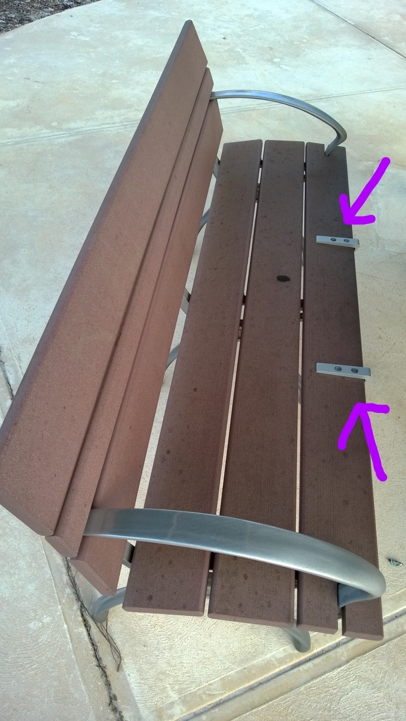
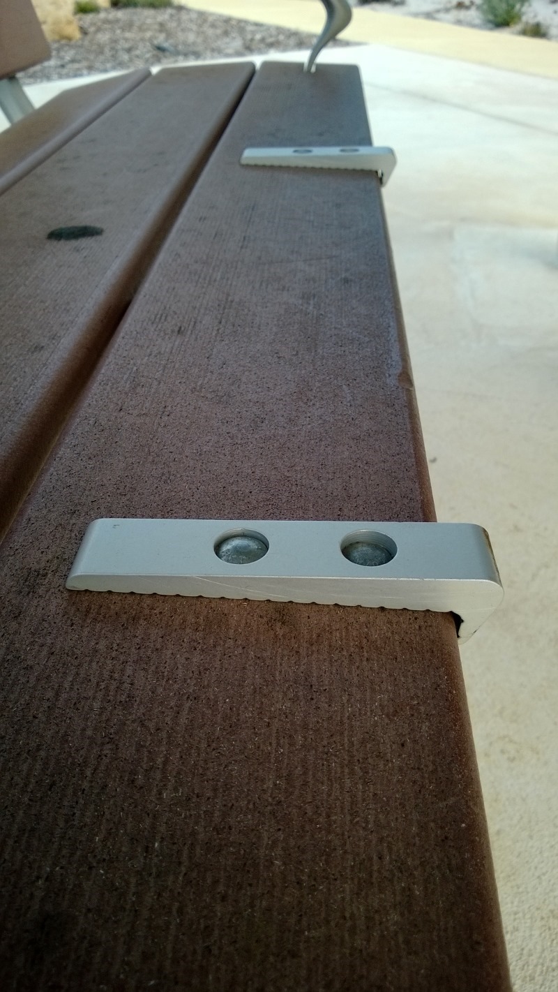
Look at these images I took at a new local barbeque spot and notice the highlighted adornments.


These metal parts on the bench seat don’t perform any structural purpose, they are purely there for aesthetical reasons. The only problem is, when sitting on these benches, these adornments get in the way and are uncomfortable to sit on or near.
This is an example of an adornment, purely for some aesthetical reason, that actually harms the useability of the thing, i.e. that a bench is for sitting on and should be comfortable.
This all assumes that the design goal wasn’t to deliberately make them uncomfortable so people wouldn’t sit in them for too long.
As William Morris put it: “Have nothing in your houses that you do not know to be useful, or believe to be beautiful.” Perhaps the loftiest goal of design, is to make things that are both useful and beautiful.
Edit: 2nd Oct 2013
Dan Rigby (@danrigby) pointed out that these could be for deterring skateboarders grinding on the benches. While you can’t see it clearly in these photos the benches are part of a bench-table configuration so would be hard to image skateboards being able to grind on them as the front face of the bench is not open facing. However this is quite interesting in a couple of ways:
1 Lack of Tailoring of Designs for Context
If we assume here that these benches are all designed and constructed the same, regardless of if they’re going to be employed in standalone configuration (which could allow grinding) or as part of a table arrangement (which naturally helps prevent grinding).
This demonstrates that where a design could work in one context, it may not work as well (or at all) in another context.
If the above assumption of the homogeneous nature of all these benches is true, then it may also point to the cost of “good design” – for example the local council may have had to pay more for ordering different configurations of benches.
2 Users Don’t Always Understand the Reason Behind Design
In this case the user (me) had no idea of skateboard grinding being a problem on benches. This led to (albeit mild) annoyance when using the benches as I didn’t understand the potential point of the design. It’s an interesting question as to how to make the point of these anti-grinding devices more obvious. The easiest way would be to etch some for “anti-skateboard” description or diagram.
This of course assumes that many people would even notice and question the design aspect behind these things :)
(If you’d like to learn more about design related topics such as Typography and colour, check out my Pluralsight Introduction to Design course.)
SHARE: