This is the first in a new series of articles I want to start, noting user experience things I use/see and observing how they could potentially be improved. The articles in this series aren’t meant to be mean or critical, merely observational.
In this article we’ll be looking at the TED app for the Xbox One. (If you haven’t heard of TED before, they are videos of talks on technology, design, art, etc. some of which are deeply moving and inspiring).
Here’s a screenshot of the main menu.
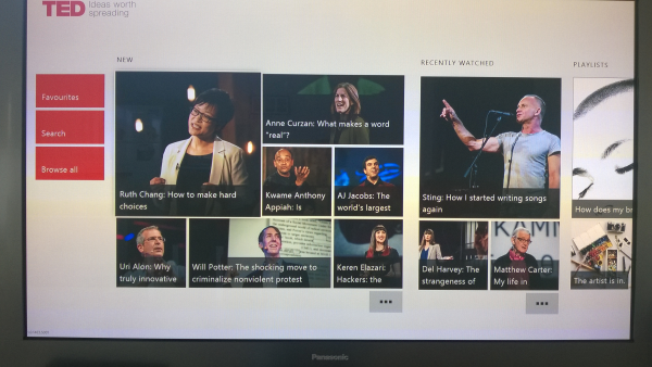
Overall I love this app, clean and simple, it’s also nice that it’s themed white as a change from the other darkly themed Xbox apps such as the Video app.
The groupings on the main menu are nicely grouped and intuitive and follow the basic Xbox One UI patterns.
There are however a couple of specific user experience things I struggle with in this app.
What Video is Currently Selected?
The first is when selecting a video to watch. Take a look at the screenshot below: which video is currently selected? It’s hard to tell right?
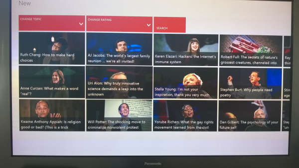
The currently selected and not-selected items are too similar, we need the currently selected video to stand out, or to put it another way: there is not enough contrast between selected and unselected.
Below is a mock up of what simply adding the TED red brand color to the selected video border could look like:
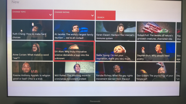
Now we’ve increased the contrast/decreased the similarity between selected and unselected videos.
Alternatively we could make the background description color a pale red:
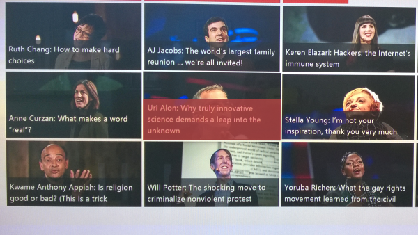
Again these are just lo-fi mock ups but they show some ways we could start to think about making the the currently selected video more easily distinguishable.
Playlist Play
Here is a screenshot of a playlist with one of the videos selected:
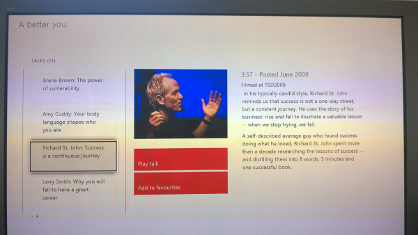
Hitting A on the controller unfortunately doesn’t just go and play the video. You have to go across to the “Play talk” button and then hit A. Every time, I make this mistake, and there’s a “cognitive pause” while I wonder why the video isn’t playing.
Moving across to the play button:
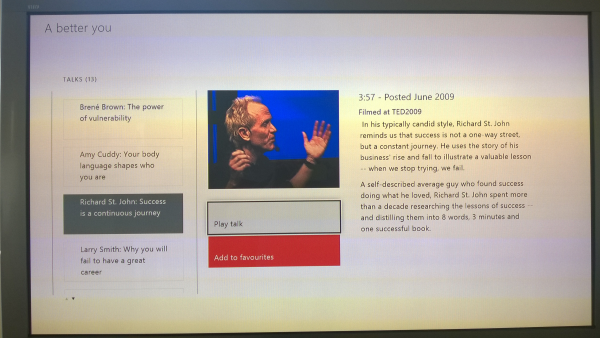
To fix this we could simply make pressing A on a selected video in the playlist (as in the first screenshot) a “shortcut” to playing the video by hitting A.
Feel free to comment if you have other observations or ideas for improvement or you think this is a good idea for a series.
SHARE: