Sometimes design (and designers) are thought of as the people that make stuff look pretty. While aesthetics is a part of design, it’s not its sole function.
Design is problem solving
When aesthetic considerations are placed above the problem or the design goal, user discomfort or dissatisfaction can occur.
Look at these images I took at a new local barbeque spot and notice the highlighted adornments.
More...
SHARE:
When designing an app or website it can be hard to come up with inspiration for colour ideas. One place to look is the local hardware/DIY store.
These stores usually have colour sample cards from the different paint manufacturers that are sometimes helpfully grouped into related/complimenting shades.
This image shows some cards from my local hardware store showing some purple and pink hues.
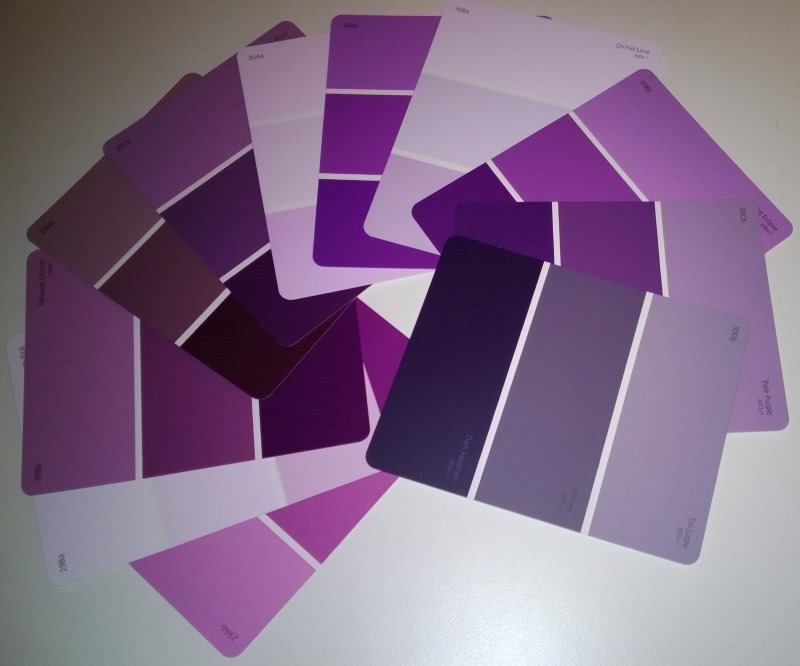
While it’s a low tech approach, it’s cool to see a whole load of colours “in the flesh” when these cards are laid out on the display stands.
If you’d like to learn more about colour choice and other design related topics such as Typography, check out my Pluralsight Introduction to Design course.
SHARE:
If you want to prevent the default action happening when a user presses the back button on a Windows Phone you can override the OnBackKeyPress method in your page. To prevent the default back behaviour (e.g. navigating to the previous app page) you can set the Cancel property of the CancelEventArgs to true.
The following code shows how to prevent the back button from navigating to the previous page if a UI element called “ShareChoices” is visible:
protected override void OnBackKeyPress(System.ComponentModel.CancelEventArgs e)
{
    if (ShareChoices.Visibility == Visibility.Visible)
    {
        HideShareChoices();
        e.Cancel = true;
    }
}
When deciding to override (and cancel) the default back button behaviour, be sure that it’s sensible and intuitive to the user. Incorrect use may result in certification failure.
One use that I’ve seen is in data entry apps. On the main page, the back is intercepted and if there are unsaved data entry changes an “are you sure” dialog is displayed. You shouldn’t do this “are you sure you want to exit app” on apps where there is no loss of data if a user exits. In these cases this kind of “exit prompt” will be annoying and pointless to the user.
SHARE:
A Desire Line (or Desire Path) is the shortest or easiest way to get from where you are to where you want to be.
In the physical world we can see these in parks or grassed areas as paths worn away by people’s feet.
Take this photo:
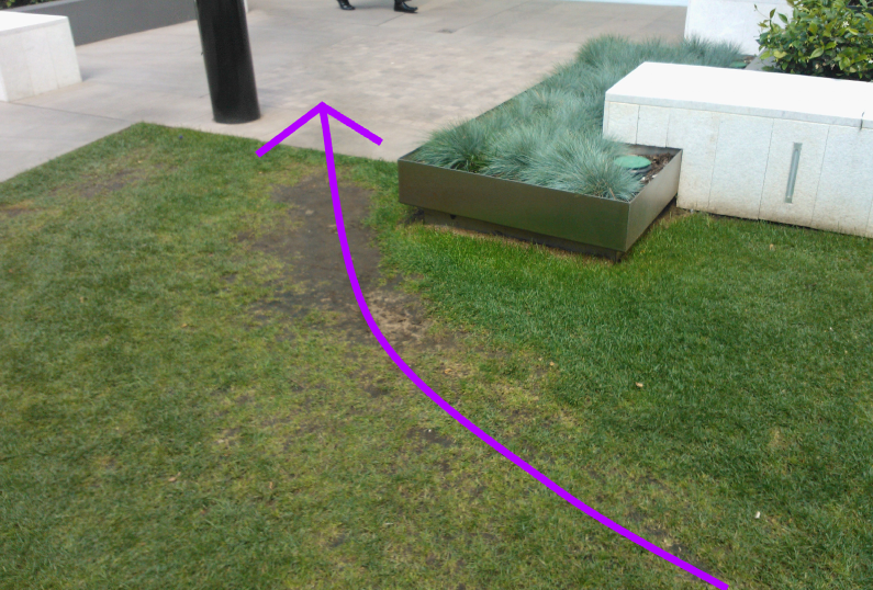
This was taken not long after the opening of a new building. The photo shows part of an entrance area to an office building and mall entrance.
More...
SHARE:
Take a look at this photo I took of a contactless style of payment terminal at a local grocery store. This is the kind of terminal that, with a compatible credit/debit card you can just tap, hover, or wave you card in front of the machine rather than inserting and keying in a pin number.
Notice the extra handwritten instruction taped to it: “HOLD CARD BELOW”.
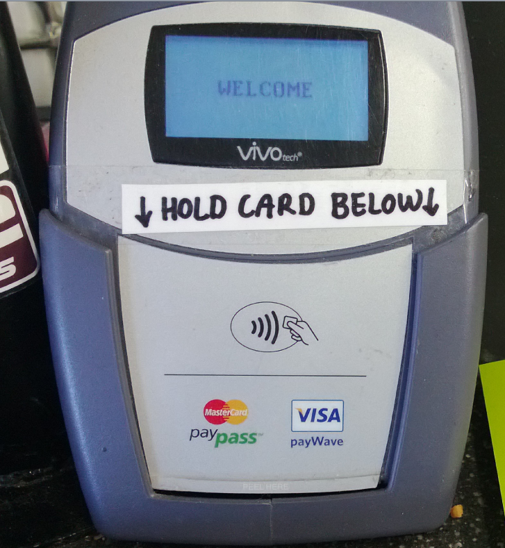
The fact that the staff of the store had to modify the machine in this way gives us a clue that there may be a problem with the design. It suggests that some customers were holding their cards in the wrong place, perhaps at the top of the machine, and thus not initiating a payment.
We can see that the only perceived affordance of where to hold your card is the little diagram in the middle.
Whilst I’m not a hardware designer (and without perhaps performing some usability studies) I thought it would still be fun to mock-up some changes.
More...
SHARE:
One way of thinking or planning colour is to think in terms of relative expansiveness, that is, the proportion of the use of different colours.
One way to describe this proportionality is to think in 3 groups:
- The Dominant Colour: proportionally the largest expanse of colour, e.g. the ground
- The Subdominant (or subordinate) Colour : the second largest expanse of colour after the dominant
- The Accent Colour: the colour with the smallest relative area
This doesn’t mean that we can only ever use just three colours, but it’s a nice conceptual model. We could, for example, have a single dominant colour and a single accent colour; but we might have 3 shades of a subdominant to create a greater range of visual possibilities.
A simple way to visualise this is to use a subdivided coloured square.
More...
SHARE:
The Gestalt Principals help us to understand human perception. The application of these principals can help us create better user interfaces and improve the overall user experience.
The Problem
Peregrine is a great free Twitter client for Windows Phone, although I love Rowi as well the last time I changed my Windows Phone handset I decided to give Peregrine a go and haven’t looked back.
I was using it this morning and noticed someone had mentioned that they were watching my new Pluralsight course. It also looked like this was a retweet.
Look at this screenshot:
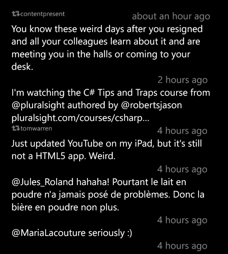
I thought the Tweet that I was mentioned in was a retweet from tomwarren.
It’s not; the retweet indicator belongs to the tweet below: “Just updated YouTube…”.
So what are some of the ways we can solve this design problem?
More...
SHARE:
My newest Pluralsight course has just been released.
It’s about learning the fundamentals of design and applying them to your own work.
It covers topics such as: typography, colour meaning and choice, fundamental Gestalt Principles, and some other important and useful principles.
From the description:
“Design is all around us but most of us don't notice it. By the end of this course you'll start to notice design elements in everyday life. By understanding the fundamentals of design, you can start to apply them to your software UI & UX, marketing materials, emails, web design and pretty much anything else you produce.”
You can check it out here.
SHARE:
It is with much excitement that my first ever Pluralsight course on Designing Windows 8 apps has just been released.
The course leads you through the process of capturing and evaluating ideas, choosing and prioritising app features, and onwards into actually designing the navigation experience, user interface, and integrating your app into Windows 8.
You can check it out now, if you don’t already have a Pluralsight subscription you can check out my course for free by signing up for the free trial!
SHARE:
Sketching out designs and creating paper prototypes can help to visualise your app and correct design mistakes earlier and before coding begins. To help with this I've produced the following paper prototype templates to help (right click & save):
More...
SHARE: